Every business strives to reach the broadest recognition possible. In order to become worldwide famous, entrepreneurs apply all possible means of their brand promotion. Once you get to the top, the rules for “the game” change.
World-known brands go in for every imaginable ways to attract customers’ attention. And one of them is rebranding (or brand redesign). In this article we are going to take a closer look at several fantastic redesigns of big-name brands.
Mozilla is a non-profit organization that targets to make the Web better by launching open-source software products. The company was founded in 1998. At the moment it has 11 offices around the globe with headquarters in San Francisco and approx 1,000 of devoted employees.
The organization started their massive re-branding campaign more than 7 months ago. It is worthy to note that the whole project was held open to public.
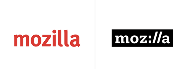
As Tim Murray, the chief of Creative Team at Mozilla, wrote in the blog article few days ago, Mozilla team has finally “reached the summit” in their brand refreshing. The result of such long, studious, complex and highly creative work is really breathtaking. Mozilla took a groundbreaking approach in the brand transformation. The wordmark font Zilla was created by Typothque and is already free and open for usage. The new Mozilla wordmark with a inkling of URL language symbolizes the rooted connection between Mozilla and the Internet.
The color palette accounts for several main colors of fonts for the wordmark on the black background. Quite simple and official logo is combined with numerous weird and unusual images.
Designers experimented with different types of imagery. They’ve selected dynamic, unique and bright pictures that reveal the constant evolvement of Mozilla and the Internet itself. All in all, this complex transformation that included thousands of users’ feedbacks and implementations of the most sophisticated ideas resulted in such motivating and dynamic logo that perfectly reveals the main ideas of Mozilla.
National Lacrosse League
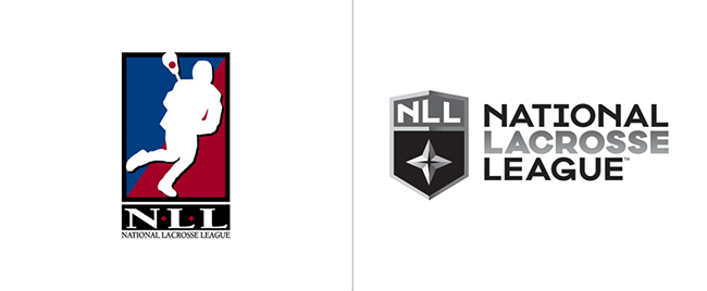
Another sensational brand redesign was held recently by National Lacrosse League. The NLL organization was established in 1986 and it’s the leading men’s professional lacrosse league in America. The NLL is as important and influential sport institution on the territory of the States as well as the NBA or the NHL. The NLL logo redesign is a part of a huge digital marketing campaign that the company is holding these days. The new logo is designed in classic and minimalistic manner.
The central symbol of the composition is anchored by a four-pointed star that symbolizes the four original NLL men’s teams. This element carries an important meaning of a kind of a guide to the future for the league.
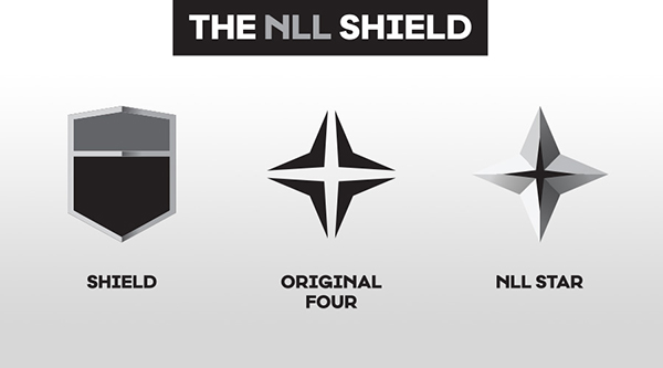
The star is settled on the shield that reveals the warrior spirit of the nation and sportsmen especially as they must evince firmness, confidence and strength of their mind and body in order to achieve the best possible results in sports competitions. Also, the NLL shield can come in the colors of each lacrosse team. On the whole, the new logo design is not that perfect but still serves quite good to the NLL and definitely looks more natural and tasteful.
Juventus F.C.
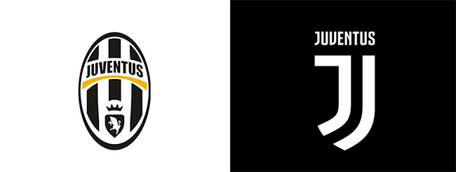
Juventus F. C. is a famous Italian football club widely recognized by football fans around the world. It was established in 1897 in Turin, Italy and has figured in history as one of the most successful soccer teams. Juve presented the new identity in January 16, 2017 on the walls of one of the clubs venue in Milan.
Juventus club badge redesign is only a part of a revolutionary growth plan “Black and White and More”. The campiagn is aimed to instil the feeling of pure interest and love to soccer of non-football fans.
In such a manner, the club’s promoters plan to popularize more Juventus itself rather than soccer as a game or sport. The renewed club badge is iconic, universal and laconic, still carrying extremely huge and serious sense. The new club identity will further be used by the team to make Juventus recognizable more a separate brand, which the founders are planning to expand to jewelry, backpacks, a coffee shop.
Launching of the new club badge arose a massive wave of fans’ resentment and bemoaning of the old logo. However, it is quite evident that the new format and fresh concepts Juve plan to incorporate in their brand promotion work better and look more stylish.
Although, there are not many elements on the club badge, all of them were performed masterly and tastefully. The letter “J” is designed amazingly, adding a lot to the traditional black-and-white concept. The shield, which is described fractionally, addresses to the main idea of anchoring Juventus to soccer. At the same time it conveys the desire of the club to go “beyond football”. Ultimately, the new Juventus identity, bold, stylish, and ostentatious, will surely help expand the possibilities of the club as a full-featured lifestyle brand.
Conclusion
Changes are usually for the good. Everybody sometimes loses some freshness and sharpness of ideas. The given examples of famous brands redesigns illustrate human constant desire for changing the world for better. Obviously, this successful experience of world-known brands will push other famous companies to try something new in their corporate identity builidng.

Get a Custom Solution with Web Design Sun
At Web Design Sun, we specialize in building web applications for clients in every business and industry. If you’re interested in custom applications for your business, contact us today.
Contact us today to get started

