If you want to succeed in the digital world, you have to follow all major trends in design and development. Web design changes and evolves as time goes and the whole web universe transforms. As 2017 is already here, it’s high time we all found out the major web design tendencies that will prevail during the year.
You, probably, got used already to constant changes in web design. Every new year goes marked with some fresh ideas or transforms and upgrades the well-known concepts. So, don’t stay out of the web design swim this year and get inspired by the main trends of design for 2017!
Bold and big typography
You better don’t underestimate the power of fonts on your page. In 2017, typography will be effective only when it’s bold, thick and serif. A typeface is a great instrument to set the tone and style of the website. The constant evolution of the devices and screens enables designers to experiment more with forms, shapes, space, colors etc. And here you should understand that big typeface doesn’t necessarily mean that the words will be made bigger. We speak about dedicating more space and focus on the page to a single, but all-embracing statement. For example, about the company, product or service.
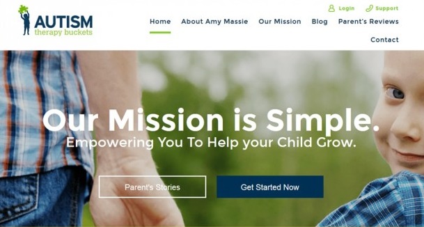
While working on the website for Autism Therapy Bucket our designers decided to stress harder the core of the client’s specialty. By using the large typeface for the central statement the designers managed to attract more users’ attention and improve the traffic.
However, oversized lettering works the best when it’s given a lot of space and when it breaks the grid. Don’t be afraid to sacrifice a bit more real estate of your site to the main statement on the page than you usually do. That will help you put more emphasis on the core details. So, you can expect to see soon much more websites with over-sized and full screen, bold and unique typefaces.
Better collaboration between developers and designers
Designers technologies are continuously evolving and improving. Fast prototyping tools have become more like real programming language rather than a simple toy. That is why, in 2017, we expect more collaboration between developers and designers on creating the most beautiful layouts. In order to increase the productivity and empower the possibilities of graphic design, designers pick up more and more principles from programming. Working with advanced technologies, developers and designers have better collaboration and understanding of the process.
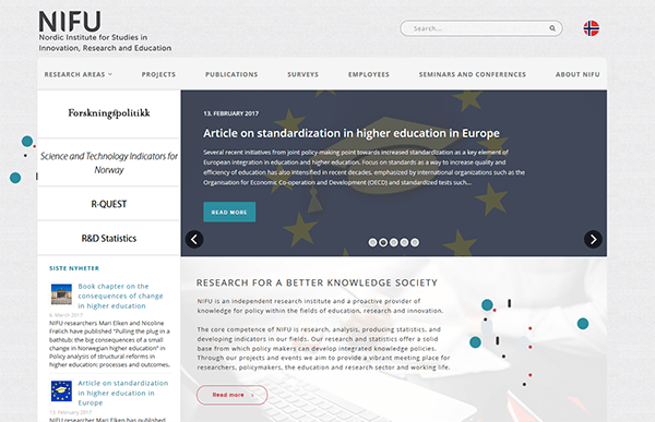
The Nordic Institute for Studies in Innovation, Research and Education (NIFU) website was created in close cooperation of developers and designers. This massive project that included employment of several software technologies resulted in an accurate, well-featured platform. The website has a pleasant color palette and smartly organized structure.
With the help of modern technologies, designers can explore how to use the screen capabilities to present design even more effectively. Creating really great digital products today demands usage of more complicated software. That results in further merging of design and development.
More Video Content
GIFs are great, but video content is becoming one of the most popular web design trends of 2017. As well as animations, moving images in videos capture the user’s attention, thus gaining customers confidence and precisely conveying the message to them. Video is an excellent information channel, very useful for storytelling, advertising, promoting, marketing and much more. Videos with sound are an incredible chance for you not only to catch your clients’ attention but also educate them, inform and entertain.
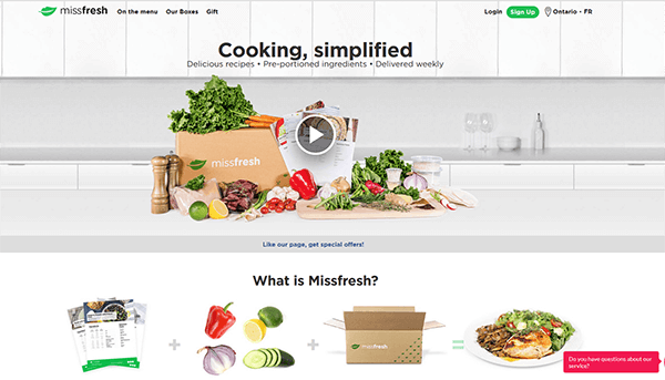
The web design of MissFresh serves as a brilliant example of how powerful visual effects can impact the overall impression. On the front page, there is a dynamic and colorful video. That immediately gives customers peculiar information about the website and the services.
Mostly, videos are used as an attractive background for the content, however, they still carry massive value. High-quality video content will help you attract more clients, but you should keep in mind that playing a video on your site must be optional. That is your visitors should have a choice of pressing a “play” button if they feel like it. Also, don’t forget about “mute” option. Don’t be very intrusive, and give your customers a freedom to the full extent appreciate the visual effects on your website.
Unique Illustrations
Eventually, it’s time to face the truth that we are fed up with stock images, that travel from a website to a website. That is why 2017 can be officially called a year of authentic, original and unique illustrations in web design. What is important here is to find a really talented illustrator able to create bespoke illustrations that will match the brand’s tone and convey the brand’s concept to the audience. An original illustration style smartly presented, can be further employed through the entire corporate identity of your brand.
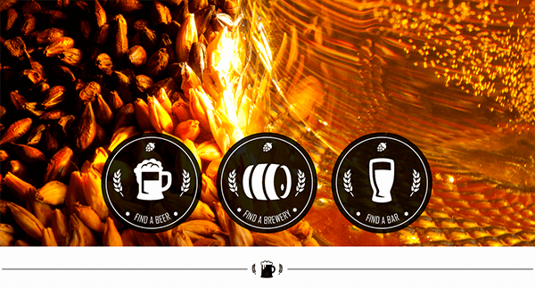
During the Brewery website development, our designers got a task to create unique and tasteful illustrations. As a result, you can see accurate, tailor-made icons that fill up the overall design concept of the website.
All the fresh ideas you are ready to implement in your web design can be incorporated in illustrations. Users always pay attention to original images. And they will surely spend more time on your site viewing the unique visual content of your website.
Content-oriented Design
The era of relevant content has finally begun! Everything and everyone are about content that does carry value and sense. This tendency gave a push to another tendency in web design. Believe it or not, but customers visit your website for decent content, first of all, be it movies review, some thoughtful essays or some throw-away stuff. And so the design has to be made up in such way to present this content efficiently and significantly. Giving more attention to context means cutting the size and number of some extra elements like sidebars, headers, footers and so on.
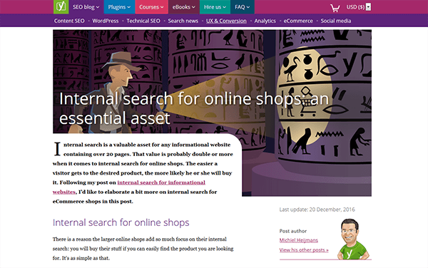
The way Yoast presents the content is simply adorable. The Verge takes a really bold and smart approach to covering massive amounts of SEO and digital marketing content. There are no bulky, heavy elements on the page that prevent viewing of the text.
However, there is an opinion, expressed by numerous professional designers, that making a design more “flat” to present the content better, can affect the very soul of web design. Still, a content-oriented design will surely be prevalent moving forward in 2017.
Experiments with Colors & Gradients
Certainly, we should mention in this article the main instruments of graphic design – colors. In 2017, designers will choose braver and bolder color palettes for web design. Experimenting a lot with different colors combinations and gradients. Choosing the right color, and especially if it is unusual for web or your brand style, may greatly impact the outlook of the whole brand eventually. We expect seeing more vivid and bold colors in brands logos, images, illustrations and other.
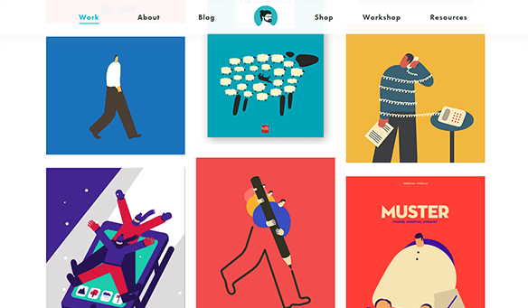
Magoz preferred to move from calm pastel colors to brighter, bolder and punchy palette. At the same time, the website doesn’t look like a chaotic mixture of different colors and tones but is well-balanced and harmonical.
While designers will strive to experiment more with colors to fascinate the audience and draw their attention, it’s necessary to keep in mind that color can both help your site or ruin it. That’s why it is important to figure out what kind of emotions and impression you want your website to arise. To opt the most optimal colors that will fit your brand and concept.
Increased use of hand-drawn elements
Original and creative hand-drawn elements have again become one of the major design tendencies. Among such elements, there are fonts, illustrations, buttons, graphics, icons and many more other things that can bring a delicate and stylish touch to your website. Hand-drawn elements are a great change from some standard elements. They definitely help reveal the individuality of the designer. Well-featured drawing helps designers break the mold of the traditional web design concept and gives more space for creativity.
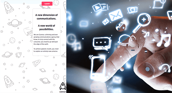
Cosmos Agency website is a great example of how hand-drawn elements helped the designers to create a unique, marvelous site. Thanks to the originality and uniqueness of the hand-drawn elements, the website looks very fresh, interesting and memorable.
Hand-drawing is not easy. Though, if you want to have something really special on your website, spend some time searching for a talented designer. However, be sure that hand-drawn elements will create a fantastic user experience for your visitors and help you increase traffic.
Conclusion
Web designers now have plenty of stuff to learn and take into account in their creative work. What is really great about modern web design is that you get so many opportunities to create something unique and eye-catching using all the same instruments. Surely, there are much more web design trends that will roll out in 2017 and you could share your vision with us in the

Get a Custom Solution with Web Design Sun
At Web Design Sun, we specialize in building web applications for clients in every business and industry. If you’re interested in custom applications for your business, contact us today.
Contact us today to get started
