Web design has come under increasing scrutiny in the real estate world due to competition in home buyer and renter lead generation. Many real estate agents have put up their own landing pages in an attempt to make their lead generation more personable and accessible, but it often does the opposite as websites are hard to keep up with.
If you want to build an incredible real estate site design, you have to consider that people still want to talk to you and see real listings that are available. If you are not updating listings when sold or rented, or if you have old contact information on your contact page, your website will just be a landmark on the web for your business.
There is so much more potential for you as a real estate agent if you look at your site as a fine-tuned machine that should be cleaned and optimized every day to get the best results.
Not quite sure if you have the time? When a successful website starts converting leads every day, you’ll think twice about how much your site matters to your business.
Quick Ways to Enhance Your Website
- Feature timely (less than a week old) real estate listings on the home page with photos and contact information.
- Include a form on the home page for lead generation and subscription signup.
- Publish a headshot, license information, and testimonials to build trust with potential clients.
- Enhance your website with sorting and filters that relate to property listing types, square feet, price, bed and bath counts, and so forth.
Real Estate Digital Marketing Breakdown
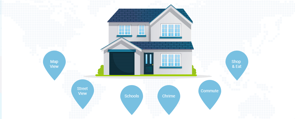
List housing area information. You can do this using API plugins in some cases that connect to a database to pull in crime statistics.
So just how do you beat out the competition in the real estate industry?
The real estate industry has a lot of competition. There are multiple agencies, brokers, and agents who all want to find leads in the same market. In this digital world, all of that advertising can dull down your own message as you try to win over customers online.
A new study from the National Association of Realtors stated that nearly 95% of all millennials and 84% of all baby boomers start a search online before buying a home.
This is a great opportunity if you have a website with a conversion-focused design. Brand credibility, simple forms, and listings are important to winning over a real estate lead.
In addition, you also want to make sure that your website satisfies what your customers are looking for. They likely are not just looking to give you a lead. Listings, helpful information, blogs, and other information can really make your website stand out in a crowd of people just trying to sell a potential customer on their services. That’s why it’s so important to focus on the design.
These are some steps you can take to improve your real estate website design and amp up your performance in the lead generation game.
The Right Messaging Where It Counts
In so many cases, many websites have too much copy. It stifles the imagery and call-to-action that otherwise would make it so clear what you want the customers to do. The way to build content is by talking through goals of each page.
For example, what do you want to do with your homepage? What does your customer want to see on the homepage? How are competitors treating your customer on the homepage? Just by asking and answering these questions, you’ll get a better idea of how to design a homepage that still uses your idea but doesn’t dumb down the message with too much text or bad imagery.
User journeys typically start on the homepage or your social landing page, so you want to make sure that these pages have a strong call-to-action to what you want the customer to do. What do you think a home buyer is looking for in this market? That’s a great question to answer for your customer right when they land on the page.
Add Real Estate Prospecting Tools
When home buyers, renters, or sellers are looking for a real estate agent, they are trying to how your site can help them. While most sites focus on just supplying listings, there are a whole slew of tools out there that might your site more valuable to the potential client for one reason or another.
Some of those tools and quick tips include:
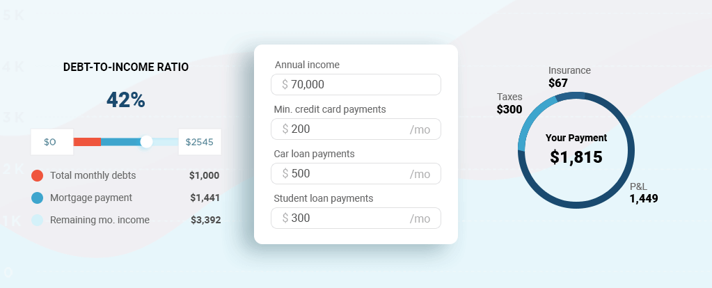
- Mortgage calculator;
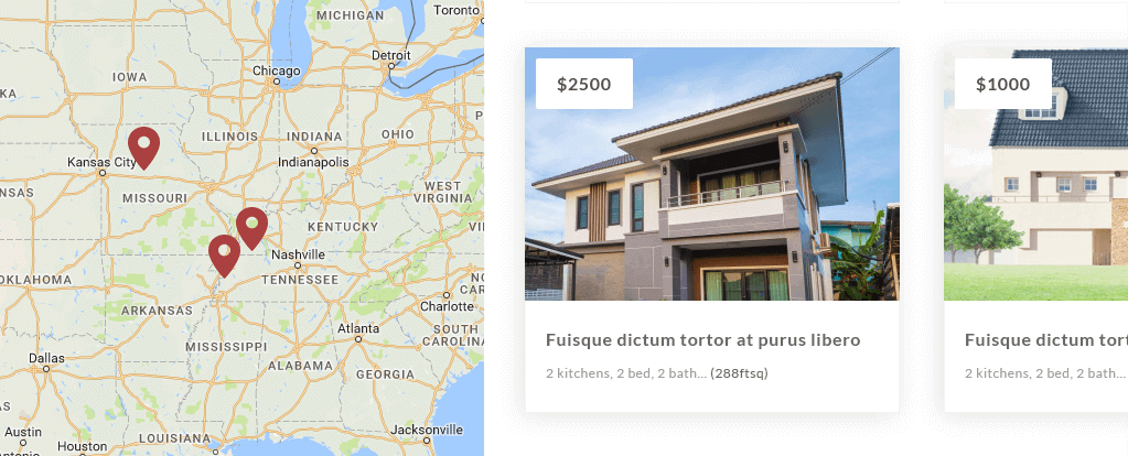
- Map view with prices, foreclosures, crime and other identifiers;
- “What’s your ideal house” quizzes and surveys on social media;
- Social media sharing icons and links for easy engagement with web visitors.
Use Visually Compelling Photos
Content related to specific areas that you work in. For example, your real estate site in Chicago, IL should have a real estate Chicago blog that talks about the area, neighborhoods, market price fluctations, and other savvy real estate agent topics.
With every homepage, you want to make sure that the visuals are on-point. Stock photos have all been used before, so if you are using photos from different websites, try to make a collage or change the colors in the photo. This helps you stand out. You may want to employ a graphic designer who can help you pick out the right images or even create imagery that will be more enticing to your customers.
Write Copy Like an Expert Agent
What about the copy on your page stands out to the area where you are marketing to? You should have content that specifically ties into the markets where you are trying to sell or rent homes to potential clients. This also helps you in other areas like SEO (or search engine optimization).
What words stick out to you as a home buyer or seller? You probably have seen “Find the Home of Your Dreams” a lot in this market, so that’s not a good choice for messaging. You want something that stands out and engages customers to see your brand as more unique than your competitors. Depending on the types of homes that you are listing, you should pick out messaging that will bring them into your funnel.
You can also add interesting types of copy such as agent profiles, testimonials, home mortgage estimator, and even publish quizzes on social media to help potential home buyers “find the right home for them.” Your messaging should match the type of customer you are looking for any every scenario.
Make Your Call-to-Action Stand Out to Your Market
Your content may be an article with lots of steps and visuals, but if you don’t have a call-to-action, is your customer going to do anything with what you’ve shown them? One of the reasons that websites don’t convert very well is because the call-to-action is misplaced and doesn’t stand out enough. You can use a creative call-to-action like “Find Your Forever Home” to really drive your messaging and bring your customer further into your funnel.
If the whole purpose is to get their information for a lead, then you probably want to have a call-to-action that allows them to search listings first. This is what most home buyers are looking for. On each page, however, you should have an important for your customer to talk directly to you, whether that’s through a chat or subscriber signup.
Highlight Your Best (and Difficult) Properties
Every real estate agent knows what sells for their market. However, are you featuring the properties that people are looking for to? For example, most home buyers want to see the MOST RECENT listings. If you aren’t pulling down listings that are too old or sold, then visitors may give you a hard time for not updating your site. This leads to bad reviews and lack of return traffic.
Feature a mixture of properties that you know will sell with others that you want to promote.
There’s homes that you know won’t have any problem selling, and then you know there are some that will need to find the right buyers. You can use both to entice visitors to look at your listings and contact you.
For agents who have a variety of listings and objectives, you should show the content that matters most to you. If you spent hundreds of dollars developing a walk-through video in high definition with professional lighting and staged furniture, then why not display that listing on the homepage as something featured? You want to make the best use of your content and ensure that the right stuff gets seen first. Your best foot forward online is your most awesome content.
Getting Real Estate Leads Every Time
What’s the chances someone is going to fill in your lead form? One way to hook people and start talking to them more is through an email capture. You can do this by having a “sign up” button on the page or simply putting an email collection pop-up on the page to capture their emails. It’s important to have this call-to-action because at the very least you can send them emails about the agency, new listings, and more information to keep up the conversation.
You want several opportunities to capture information through your website in order to get a higher chance of conversion. Once you have an email, then you can start marketing to them more, creating special offers, sending updates, and staying on top of their minds as they go through this home search. You want to be the authority and go-to when they do decide to start a purchase or hire a real estate agent.
Vibrant sign-up buttons work the best in real estate website design. The messaging should be simple and easy-to-understand.
Create Sites for the Mobile Prospector
Home buyers are on the go just like you. It’s important that your site is optimized for mobile phones or else they may not be able to fill in the form to contact you about a property listing.
Everything that people do nowadays is on their phones. It’s been this way for a few years, but it’s become more apparent that people are searching all day long with their phones more than their computers. This has a lot to do with how society is on the go for most of the day or simply don’t have time to get on their desktops. In fact, the National Association of Realtors stated that 50% of users conduct a search with their mobile device or tablet during the home buying process.
Responsive web design employs a few theories, but the point is to make a website more readable by phone. Really complicated web designs are out in this concept. These websites are built to highlight content and convert.
This type of website design requires that no matter what device the user is on, they can browse your site without any friction, such as a pop-up that they can’t close or messaging that doesn’t display in the right font size. Mobile-friendly sites have a great user experience that continues to draw in customers and funnel them through the site. If you notice high bounce rates, less page time, and overall short sessions viewing your website, then you likely have a poorly designed site that isn’t meeting your customer’s needs.
Make Contacting the Agent Easier
It’s the simplest part of the design but it often gets overlooked. One thing that is extremely important in real estate website design is the ability to get in touch easily with the agent or company representative. When people look to buy or rent a home, they probably have a lot of questions prior to jumping on a listing. You should always have updated contact information and display it as profoundly as possible on every landing page. This is so that if a customer is viewing the page from a mobile phone, they can just tap your number and start a conversation with you.
Most contact pages have several ways to talk to a real estate agent. They list a phone number, contact form, email address, and even a live chat button in some cases. If you have a physical storefront, then you can add your address as well.
Conduct a Better Property Search
There are some things that are essential for a real estate property search on your page:
- Listings or map view with sorting for price, square footage, mortgage, and featured.
- Property types like single home, condominium, townhome, or other.
- Amenities like washer/dryer, pool, soak tub, or Jacuzzi.
- Housing area statistics like crime, schools, traffic, and entertainment.
Some of these you may need a plugin for if you are using WordPress. You can try the Kingsta Real Estate plug-in to get most of these features added to your site.
Here are some more details on building a better search
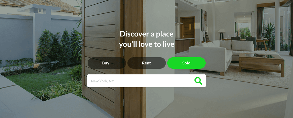
Most real estate sites have a search feature on the homepage. Search functions make it easier for customers to start looking for what they want. They don’t have to click on any of the navigation at the top. They can simply search for what they want, and typically, they want to look at listings in different areas. However, you should design your front page to meet the needs of your audience as you know them.
You can create custom search options and customize the search tabs so that it’s more pleasing to the different customers that you might get on your page. By creating a search that is custom, you give your visitors the opportunity to navigate the site right away while they try to reach their goals of finding a good home.
One site that does this very well is Trulia. They know that customers are typically looking to buy or rent a home. However, they recently added a “sold” tab understanding that this market is changing and people are looking at sold homes to compare what they should be paying in similar markets. It’s a great way to support the home buyer, which is who real estate agents are most likely trying to reach.
The search feature also has to provide what the customer wants in a visually appealing way. Once the user clicks the search button, they should see listings relating only to their search at first, but you can always suggest other listings in different zip codes.
Build Trust with Customers
The one thing that your website experience should do is show an expertise and authority on the market that is incomparable to your competitor. This means that from the home page, landing page, listing page, and contact page, you are constantly speaking from your perspective as an agency or agent. The tone that you place on the page is what will remind customers of how it feels to work with you. If you are just trying to make a general page that has listings and forms, people won’t care enough to click because there are hundreds of thousands of real estate websites that do just that.
It’s about talking to your customer in a way that relates to their struggles, while showing them how you have been able to overcome those struggles. Finding a home to buy is an exciting process. Home buyers want to feel like they are being pampered by an agent, while at the same time trusting that agent to find the right home for them, especially in difficult markets.
Real estate websites can be a beacon for customers who just want expertise and the right direction. If you can provide that with your design, then it’s likely to convert every time.
If you build your site to have these different forms, tools, and content blocks, then you show off your expertise and also keep visitors returning to your site to use your tools again and again. Matching these tools with trust statements, partner logos, and previous client testimonials will help you generate more leads as well.

Get a Custom Solution with Web Design Sun
At Web Design Sun, we specialize in building web applications for clients in every business and industry. If you’re interested in custom applications for your business, contact us today.
Contact us today to get started


