Octopus Insurance Agency Web Solution

Octopus Insurance Agency Web Solution

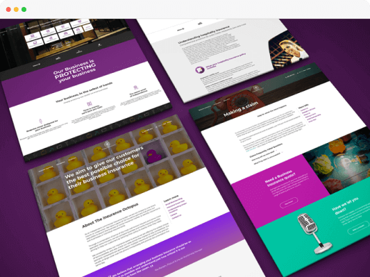
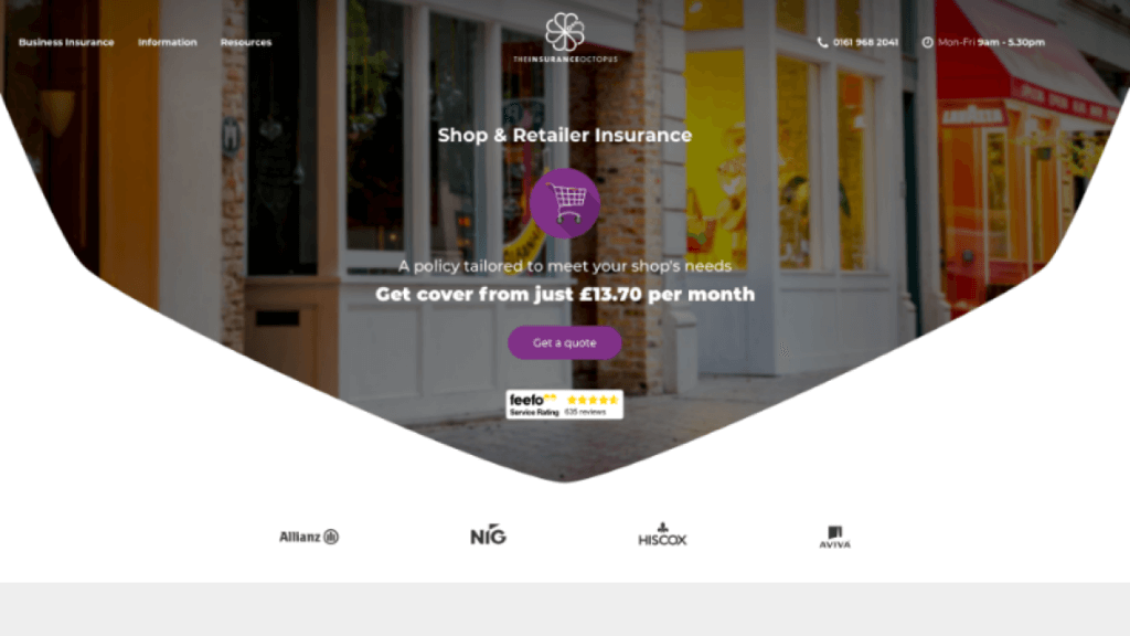
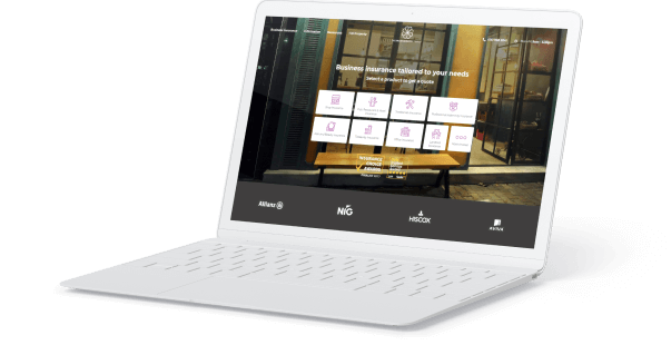
Insurance Octopus came to our web design agency looking for something different. They wanted to be able to bring in new business and leads with a clean, simple quote engine for insurance. In the land of insurance, website design has not always been a huge benefit to the user. With a bad user experience, it’s difficult to get customers to understand different services and plans that they may like.
Octopus Insurance img01

Solution

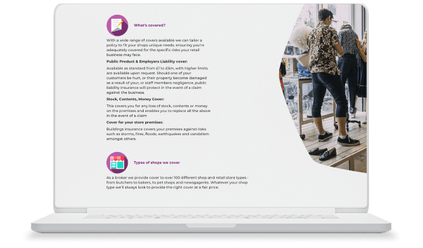
Our new client needed a high-quality, conversion-optimized insurance agent website template that provided a sales funnel for conversion opportunities. This meant there would be a lot of content around different policies, plans, and services. Insurance Octopus also had several industries that the company wanted to target. This meant that the design needed to be fluid and high-level to match the unique user case, but we also wanted to create a design that would allow the client to create pages on the fly.

Octopus Insuarance img02

Insurance Agency Website Design

The design of this site was hinged upon what the customer wants to do when they are looking for insurance. It was clear that the website needed to have a lot of content around services, but it also needed to drive the visitor right into a quote engine. This would require some custom design and development with a step-by-step funnel that would take the visitor from the home page to the quote page.

Our design team started out by scoping the project for the client. We wanted to create a new WordPress theme that would combine all of the elements that the client needed with the convenience of modern-day page building and plugins.

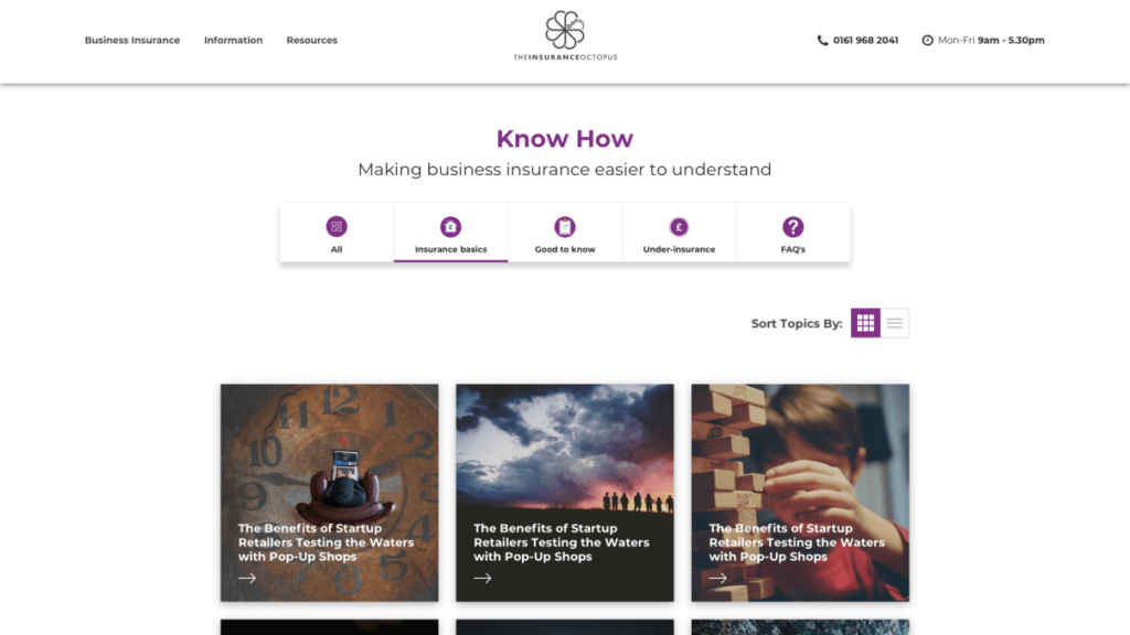
The insurance agency design is focused on different industries and insurance plans within those industries that would appeal to employers. The content needed to be presented in simplified yet attractive elements that would highlight the customer’s greatest needs.

Our teams set out to design and develop a new theme with page templates, as well as a custom drag and drop page builder. This would allow our client to build their own modules and sections as they saw fit, whether to attract new industry or start a SEO strategy.

Octopus Insurance img03

Features of the New Insurance Agency Theme

There were a few things that we knew Insurance Octopus was going to need. We wanted to develop a clean theme that would feature a modern page builder that could create column layouts on the fly. We also wanted to use shortcodes to help build those pages.

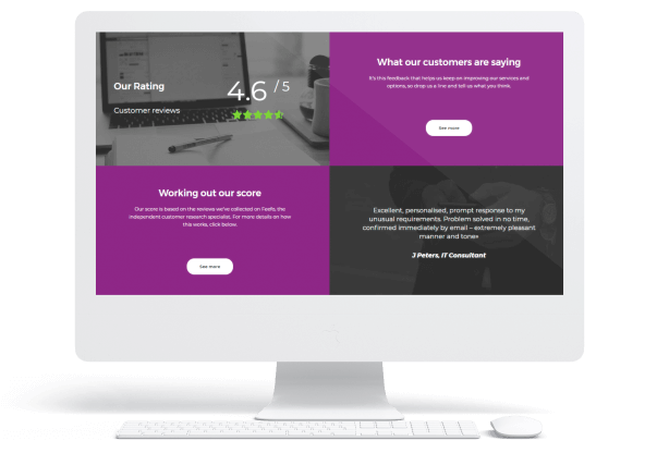
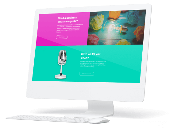
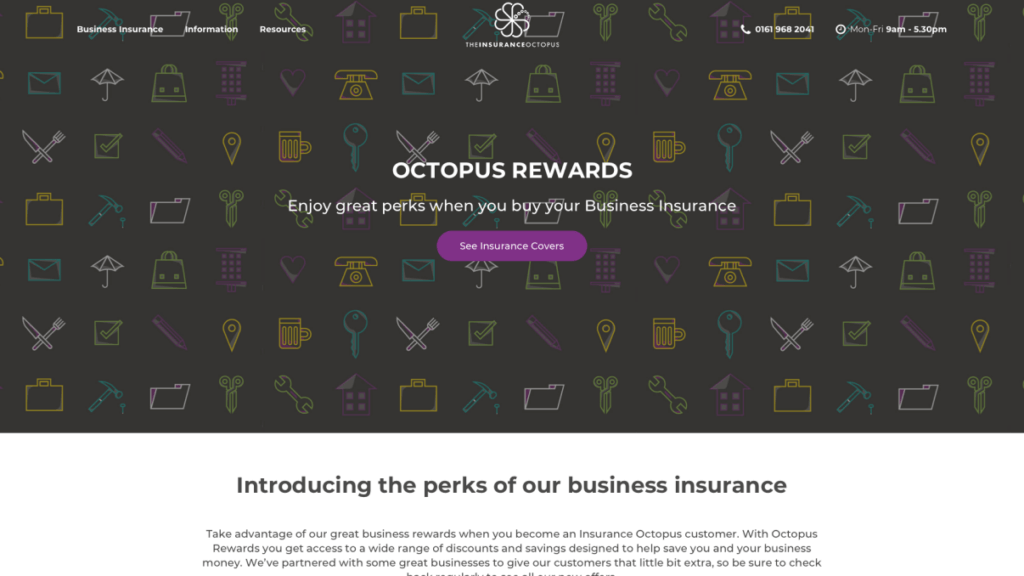
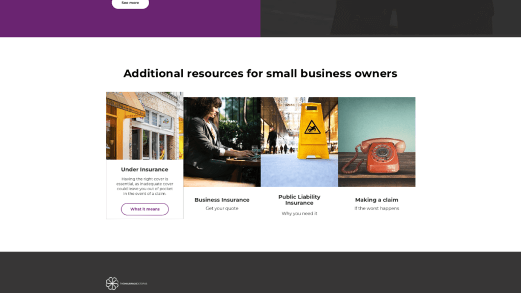
As stock imagery isn’t favorable in this industry, our team created designs and graphics that were specialized for the website, including all new illustrations for the review section and product pages. Our client also needed a new logo design.

Lastly, the website had to convert, which meant creating a user experience that would drive them to the CTA. We created an eye-popping CTA section that leads potential customers right to the phone number and link.

Octopus Insurance img04

Integration and Conversion

The development team wanted to create a website that would convert on its own and become a lead generation tool for the company. With this in mind, we set out to use Ruler Analytics and a DDI plugin to manage different phone numbers for campaigns that the company would run through the website. This helped the client manage their different lead funnels with UTM parameters. All traffic to the pages and phone numbers could be attributed back to where the customer started on the website.

Building a Better User Interface

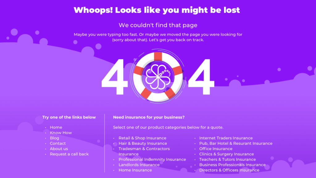
The client wasn’t sure how to build an insurance website at first, so we worked with their team to isolate their goals with the website. Insurance agency websites should always simplify the information so that the visitor is easily guided through the different pages. They should have very little friction with different elements on the page. Our developers looked at the design and site structure to come up with a simple menu that would help any user find the information that they needed quickly.

Octopus Insurance img05

Navigation strategy

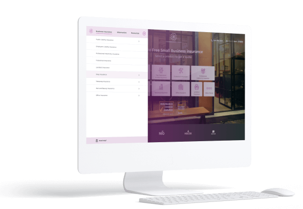
Our navigation strategy focused on a menu system with a sticky menu that is always prominently displayed as you scroll through each page. This means that users can’t ever get lost and can always navigate to another page, or click the CTA button at the top to get started.

The hierarchical menu divides the content into different areas that follow the site structure, but it also lets the user get right to the content and then navigate to other sections based on their interests.

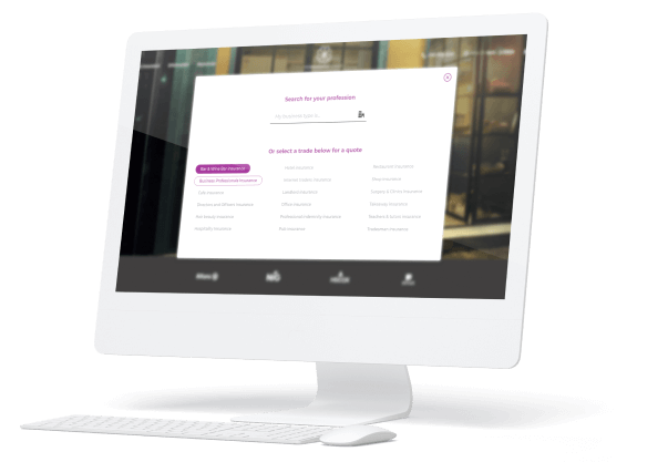
If that’s not the most convenient option, there’s always the full site search. Visitors can start typing into search to find anything on the website and navigate directly to the content that they want the most.

The navigation was built to follow category and section. With content-driven link names and design, the customer can instantly see what Insurance Octopus is providing and click on any content to get more information. Every page has a CTA that drives the visitor to take action.

Octopus Insurance img06

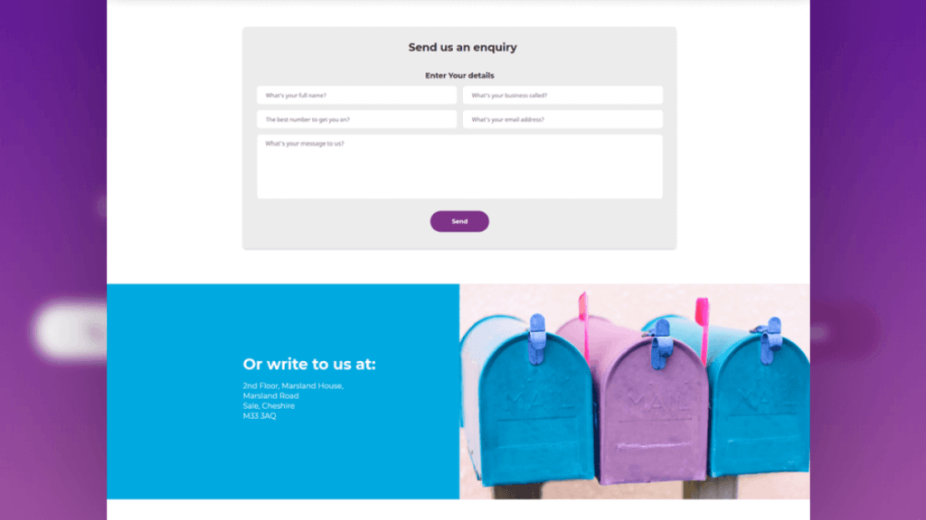
With “Start Your Quote,” the website can easily build a quote from scratch taking inputs from the visitor and delivering a downloadable document at the end of the quote that helps the visitor set up their insurance policy. This required custom development as most WordPress themes are not designed to have a step-by-step form that hooks up to a database where information is dynamically collected and sent back to the client. This is the basis for their new online lead generation programs, so it was important that this piece was easy to use for the visitor and sales team.

Building a Better CMS

WordPress is one of the most content engines in the world simply because it allows clients to set up their own users, create their own content, and easily publish to the web. You don’t have to know HTML or coding to build a page either with the right drag and drop page builders.

Octopus Insurance img07

We wanted to build a website with a content system that was easy to manage by a non-technical staff on the client’s side. The staff would be able to add, change, and delete pages without having to code any HTML, PHP, or CSS styles. The team created multiple page layouts and templates that could easily be selected to build out content instantly. This would help as the staff would be able to update information in the pre-designed pages with ease.

The CMS also applied to the use of databases that holds and displays dynamic information. Our developers created a system that could easily display formatted text, new hyperlinks, digital photos, and downloadable documents in Word, Excel, PDF, and other formats.

Save your time and Let us help grow your insurance agency by delivering leads and building your online reputation.

GET A FREE CONSULTATION
See Our Other Works

Eventbook. Event Ticketing App UX/UI Design.

The client is a ticketing company that offers premium seating services to any type of ticketed event. We created an event ticketing app UX/UI design that creates an elevated experience for users of the Eventbook platform.

Fulfillman: DropShipping App for a Logistics Company

The client needed a highly functional app that would streamline the complicated, multilayered fulfillment and shipping business. Our custom app makes it easy for managers at every stage of the logistics journey to get the accurate information they need.

YourOnlineBillBoard Design And Development

YOBB is a new concept that allows advertisers to easily buy space on a fast-rising platform for online advertising.