Elementor is a Website Builder that allows WordPress users to create and edit websites using drag and drop technique and built-in responsive mode.
What the Elementor plugin can do
The plugin has a free (Elementor) and a paid (Elementor Pro) version. They differ in the number of available functions. Let’s explain how this page builder works.
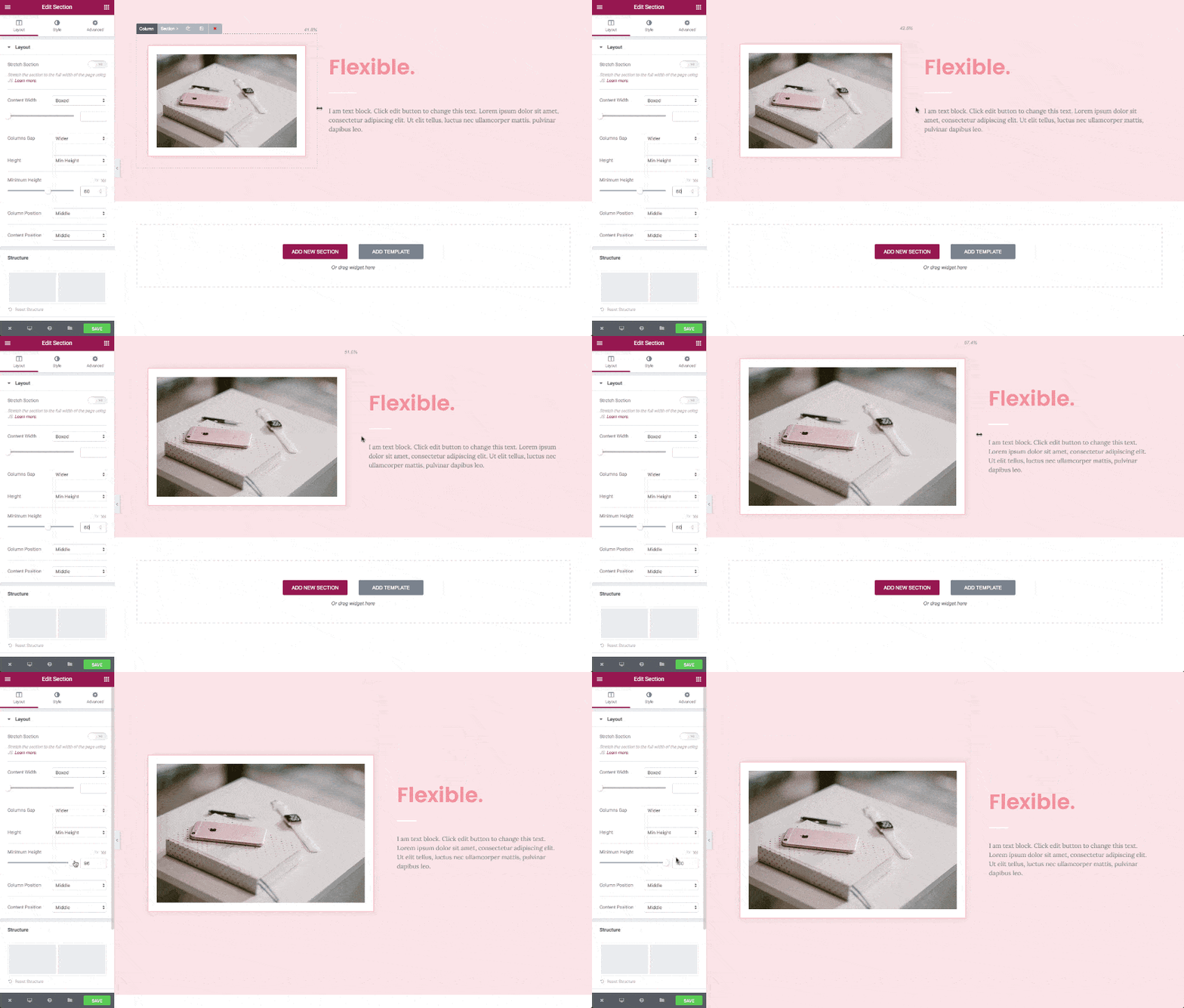
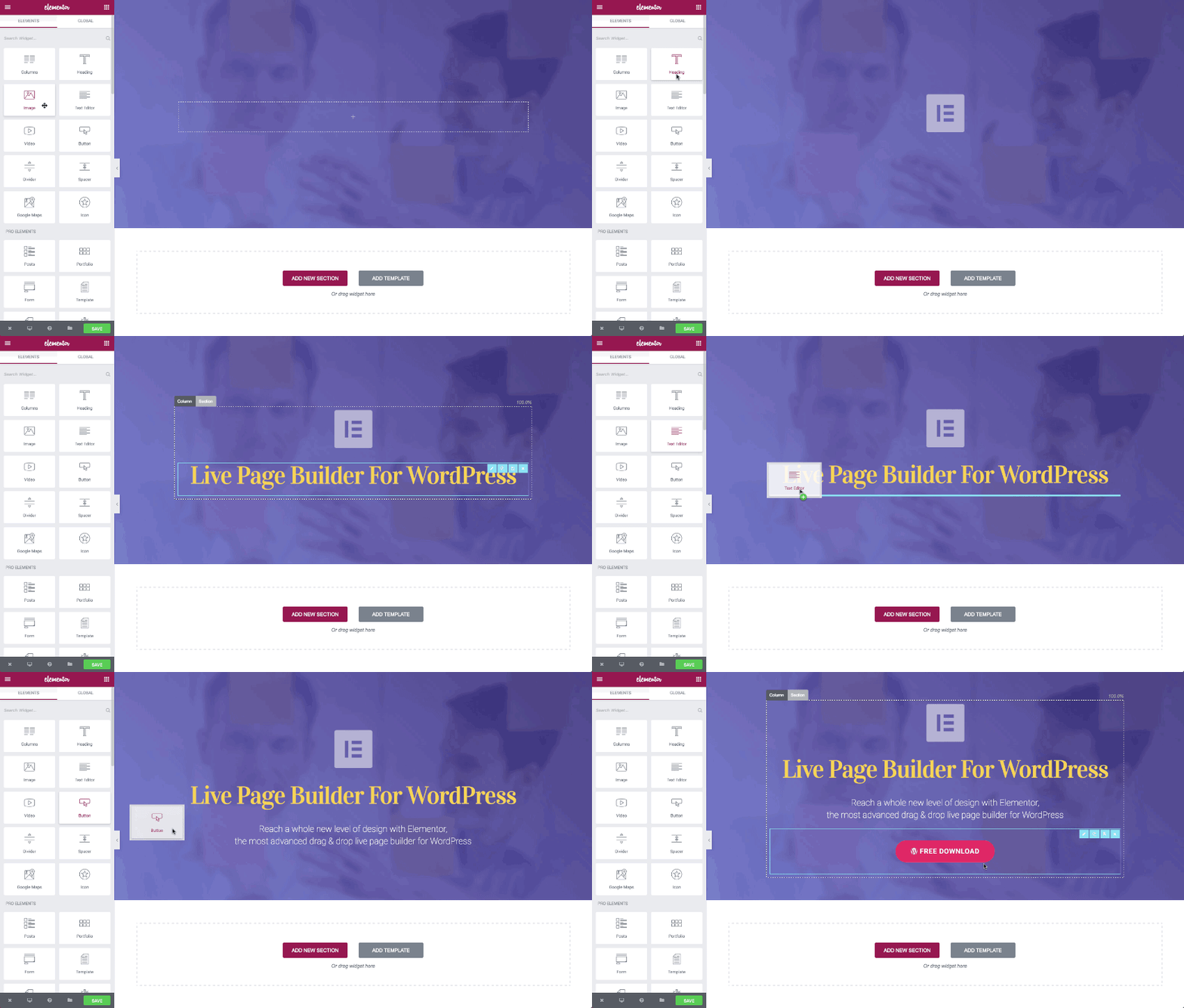
Its main feature is that the constructor immediately displays the changes that you make. That’s why Elementor is called a visual editor.
Elementor arranged on the principle of Drag-and-drop. To add an element to the page, you need to grab it with the mouse and drag it to the editing area. The page is literally assembled from elements. They are called widgets. The process of creating a page consists of several steps.
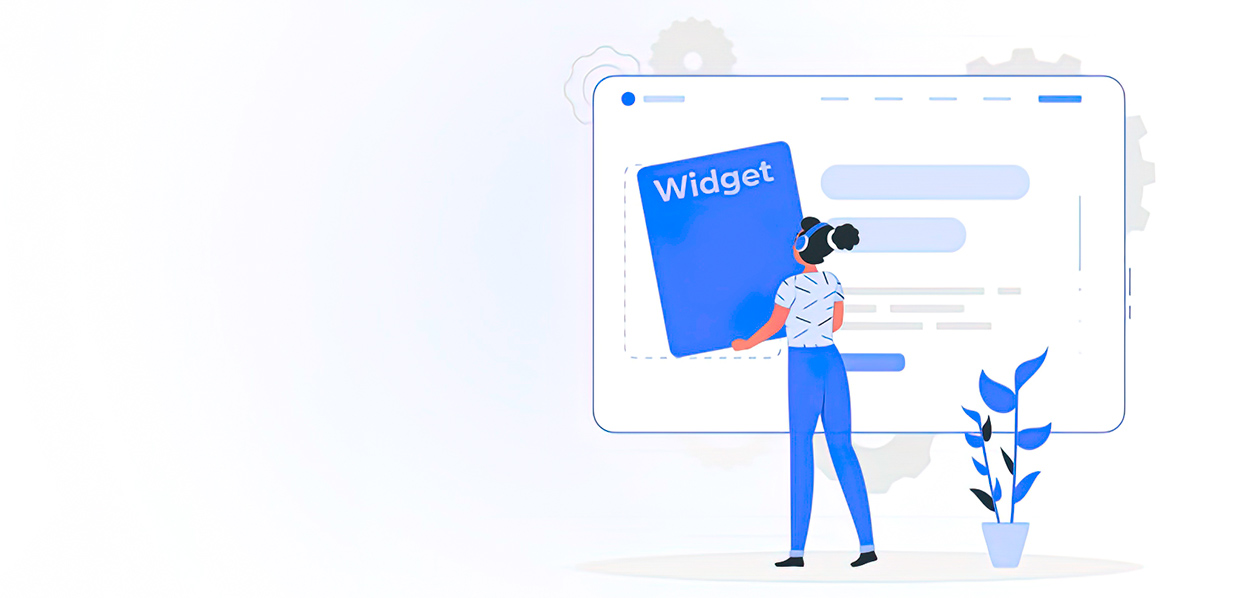
Elementor is packed with various elements or widgets. Widgets allow us to create websites and display related content. But sometimes we need specific functionality for our site. And for this, we need to create a new widget or element.
What Is A Widget?
A widget or element is a section in a graphical user interface (GUI) that allows us to display information that we want to showcase to users.
The Elementor widget is a combination of PHP, JavaScript, HTML, and CSS codes that generate custom output for us.
Elementor Widgets
Each widget has customizable controls such as input, fields, buttons, and more. With these controls, we can set our user settings and see the preview in the editor and render the final HTML code in the frontend.
Widget Structure
To create a new widget, we must extend the abstract class Widget_Base. This class has several methods that we need to override first.
<?php
class Elementor_Test_Widget extends \Elementor\Widget_Base {
public function get_name() {}
public function get_title() {}
public function get_icon() {}
public function get_categories() {}
protected function _register_controls() {}
protected function render() {}
protected function _content_template() {}
}
Widget Name
With get_name () method, we can set the widget name and return the name of the widget.
public function get_name() {
return 'Widget Name';
Widget Title
With the get_title () method, we can set the label of the widget.
public function get_title() {
return __( 'Widget Title', 'Plugin Name' );
Widget Icon
The get_icon () method sets the icon for our widget, which is displayed on the panel.
public function get_icon() {
return 'eicon-gallery-grid';
Widgets Categories
The get_categories () method sets the category in which our widget should be placed in the panel categories. There are several categories by default, including the following:
- Basic
- Pro-elements
- General
- Woocommerce-elements
- WordPress
- etc.
public function get_categories() {
return [ 'basic' ];
Create Your Own Category
We can also create our own categories using the elementor / elements / categories_registered action.
<?php
function create_custom_categories( $elements_manager ) {
$elements_manager->add_category(
'custom-category',
[
'title' => __( 'Custom Category', 'plugin-name' ),
'icon' => 'fa fa-plug',
]
);
}
add_action( 'elementor/elements/categories_registered',
'create_custom_categories' );
Widget Management
With the _register_controls () method, we can set important sections and controls for the widget.
There are several controls that we can use to customize the widget, such as the following:
User interface controls:
- UI Controls
- Button
- Divider
- Heading
- Raw Html
- Data Controls
- Text
- Select
- Choose
- Gallery
- Slider
- Typography
- And so on.
- Multiple Controls
- Url
- Media
- Image Dimensions
- Unit Controls
- Slider
- Dimensions
- Group Controls
- Typography
- Text Shadow
- Box Shadow
- Border
- Background
For more information on Elementor controls, you can check this link.
Widget Template
The render () method allows you to create front-end HTML using PHP.
The _content_template () method generates a live preview of the widget in the editor using the Backbone JavaScript library.
How To Add Controls To Our Widget
In case of opt-out, there are three tabs in the Fakir panel, which are Content Tab, Tab Style, and Advanced Tab. To add controls to our widget, we must first create a section and assign it to one of the tabs. We can then add our favorite controls to the section. As mentioned above, we have to put our code in the _register_controls () method.
Creating A Section
To create a section, we need to set the following basic parameters.
Section title
- Section Name
- Section Settings(label ,tab)
$this->start_controls_section(
'section_name',
//set unique name //set setting of section
[
'label' => __( 'Section Label', 'plugin-name' ),
'tab' => \Elementor\Controls_Manager::TAB_CONTENT,
]
);
//THE CONTROLS COME HERE
$this->end_controls_section();
We have to set the following parameters for each control as shown below:
- Control Name
- Control Setting(label,type)
Adding A Regular Control Element
Use the following control to add a regular control.
$this->add_control(
'control_name',//set unique name for control
//set essential settings
[
'label' => __( 'Control Label', 'plugin-name' ),
//CONTROL_TYPE can be TEXT, SLIDER, ...
'type' => \Elementor\Controls_Manager::CONTROL_TYPE,
]
);
Adding A Responsive Control
This type of control includes various parameter values for desktop computers, tablets, and mobile devices.
$this->add_responsive_control(
'control_name',
[
'label' => __( 'Control Name', 'plugin-name' ),
//CONTROL_TYPE can be TEXT, SLIDER, ...
type' => \Elementor\Controls_Manager::CONTROL_TYPE,
//SET FAVORITE RANGE LIKE PX, %, EM
'range' => [
'px' => [
'min' => 0,
'max' => 100,
],
],
// SET FAVORITE DEVICES
'devices' => [ 'desktop', 'tablet', 'mobile' ],
'desktop_default' => [
'size' => 30,
'unit' => 'px',
],
'tablet_default' => [
'size' => 20,
'unit' => 'px',
],
'mobile_default' => [
'size' => 10,
'unit' => 'px',
],
],
]
);
Adding Group Control
This control combines several common controls into one, such as typography.
$this->add_group_control(
//Group_Control_Class can be Group_Control_Typography,Group_Control_Border or other group controls
Group_Control_Class::get_type(), [
'name' => 'control_name',
'label' => __( 'control Label', 'plugin-name' ),
]
Adding Control Tabs
Create a tab area to add various controls.
Adding Control Tabs
Create a tab area to add various controls.
//start tabs area container
$this->start_controls_tabs();
// create first tab area
$this->start_controls_tab();
$this->add_control(); $
this->end_controls_tab();
// create second tab area
$this->start_controls_tab();
$this->add_control();
$this->end_controls_tab();
$this->end_controls_tabs();
Adding Control Pop-ups
Creating a pop-up window will allow you to display various controls.
$this->add_control(
'control_name',
[
'label' => __( 'Control Label', 'plugin-name' ),
'type' => \Elementor\Controls_Manager::POPOVER_TOGGLE,
'label_off' => __( 'Default', 'plugin-name' ),
'label_on' => __( 'Custom', 'plugin-name' ),
'return_value' => 'yes',
]
);
$this->start_popover();
$this->add_control();
$this->add_control();
$this->end_popover();
How To Show Or Hide Sections And Controls In Widgets
Sometimes you may want to hide some sections or controls in your widget, but using if / else in your code is a problem. Fortunately, now it can be done easily with the help of condition (condition) in the settings sections or controls.
$this->start_controls_section(
'my_section',
[
'label' => __( 'My Section', 'plugin-name' ),
'tab' => \Elementor\Controls_Manager::TAB_CONTENT,
'condition' => [
'Name' => 'Value',
]
//name must be unique name of one control
//Value must be the return value of control
]
Let’s say we have one control named Choose_Layout with two values – first and second. After adding the code below to any section or control, our section or control will be displayed if the return value of the Choose_Layout control is first. And it will be hidden if the return value of the Choose_Layout control is second.
'condition' => [
'Choose_ Layout' => 'first',
]
How To Automatically Change The Display Style Of A Widget From Control Settings
One of the great features of Elementor is the ability to easily change the display style of a widget using CSS code and selectors. For example, if we want to change the height of the output images, we first have to assign a class attribute to our HTML tag. Then use this class with a selector in control settings.
<img class="test-img">
$this->add_control(
'test_height',
[
'label' => __( 'Height', 'Spicy-extension' ),
'type' => \Elementor\Controls_Manager::SLIDER,
'separator' => 'after',
'show_label' => true,
'selectors' => [
'{{WRAPPER}} .test-img' => 'height: {{SIZE}}{{UNIT}};',
],
]
How To Get Widget Settings
To generate the final Html code in the render() method and the live preview in _content_template (), we will need to inject a parameter from the widget controls like height, width, font size, and more. In Elementor, the input parameter is called Settings. Using this method, we can change the settings in render().
$widget_settings= $this->get_settings_for_display();
$widget_settings['control_name'];
For the _content_template () method, the Elementor settings are stored in the settings variable.
settings.control_name
One important point to keep in mind is that settings are stored in a multidimensional array. We can get the internal setup with the following code.
$widget_settings['control_name ']['option'];
With this knowledge, you can now easily create your own Elementor widget.
More information at developers.elementor.com
We thank our developer Alexander Antonyan for sharing with us his experience in creating a custom widget in Elementor.

Get a Custom Solution with Web Design Sun
At Web Design Sun, we specialize in building web applications for clients in every business and industry. If you’re interested in custom applications for your business, contact us today.
Contact us today to get started


